Design tracker

Good and bad design I see out in the world.

Canva

01

Good design

Canva had a feature "duotone" which gave users the option to change the highlights and shadows of any image (a very helpful tool, for not just me apparently). Recently they shipped out the feature of taking this separate tool (requiring about 4 clicks to get to), to be included in the general filters. This allows the feature to be more discoverable (because they saw the feature was used) and made it easier to use (about 2 clicks).
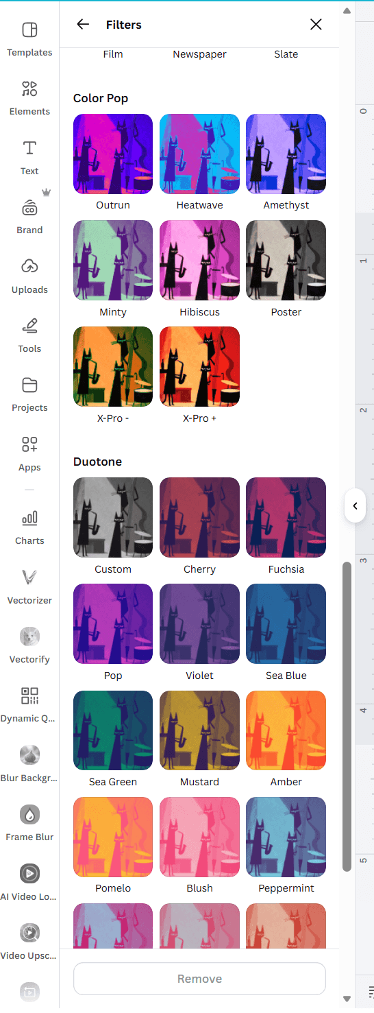
Canva filters panel with Duotone included alongside other filtersView full screenshot ↗

Slack

02

Good design

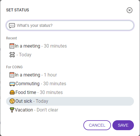
Slack -- everyone loves slack because its the optimal professional communication tool. In general it is a very well designed product. One of my favorite is the emojis that pop up next to someone DM name if they are scheduled for OOO or are on Lunch or something. It is such a clear indicator of what someone else is doing and in the place where it matters the most.

Slack status picker showing emoji statuses for meetings, lunch, sick days, and vacationView full screenshot ↗